Sunday, August 10, 2008

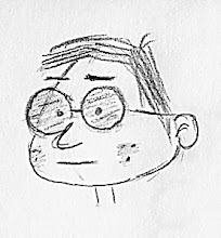
Pete Emslie-ish Sketches

If you look on the left side of the page, I have a few 'Luminaries' listed. These are artists whose art and/or career inspires me. I like everything about Emslie's style. He has a nice blog that is updated regularly. I only wish he would sell some of his art and sketches in book form.

I'll provide a link to my references because I haven't asked for permission to re post here. My drawing didn't end up looking like his, but I don't think that was the point. I want to incorporate his style in my drawing, not copy it.


Native Girl
Source Image

My face ended up looking much longer, but I kept with it anyway.


Fairies

Sketches from "How to Draw Cartoons for Comic Strips"

Sketches from another book by Christopher Hart, How to Draw Cartoons for Comic Strips.


Saturday, August 9, 2008

Post Comic Con 2008 Work


It's been a very long time since I've posted. I slacked off, set aside drawing for a while... next thing I knew, 6 months had passed without drawing! Then Elaine and I went to Comic Con 2008, and I was re-inspired! This is what I want to spend the next part of my life doing.

These are quick drawings of Rider and Slappy, our monkeys we took along with us to Comic Con. Yes, I am aware that Elaine and I are the only ones who believe they are real, but I figure that's everyone else's problem and not ours (we believe in 'live and let live').

I drew until I felt I had the essence of their personalities, so there isn't much in the way of finishing details. These drawings were done with my new Bic 'Re-Action' mechanical pencils. I like this pencil because it has a springiness that prevents the lead from snapping off as much and gradually darkens a line when you bare down instead of just getting immediately darker.

I like mechanical pencils in the first place because sharpening annoys me; if I sharpen a pencil, then draw a line, it isn't sharp anymore so I have to sharpen it again. Yes, I know by definition that this is 'anal;' that description suits me in many areas. Anyway, I found these new Bic pencils at Walgreens, but only in 0.5mm. I would like 0.7mm and 0.9mm, but apparently at this point (no pun intended) Bic just makes the 0.5mm. Oh, and the size is written on the pencil, which is always a plus. I just wish I had a way to identify the hardness better (I have B, 2B, and HB leads); I stick labels on now, but they eventually lift off and just looks sloppy.

Thursday, February 14, 2008

The Tourist, The Waitress, and a Panel

It's been a while since I've drawn. I kinda got distracted because my wife and I got new iMac computers! Ohmygosh are they nice! So easy to use and beautiful graphics. Ok, I could do a whole blog entry about our iMacs (they're FUN-O too!), but let me get to the drawings.

Both of these were done working out of The Big Book of Cartooning by Bruce Blitz. My intent is to work on more complete drawing rather than just faces and features.


From the section in the book called 'Clothes Make the Person.'


And the I thought, okay, why not try a whole panel. This is from 'Backgrounds';


When I looked at the drawing and decided to try it, it didn't look that difficult. I soon realized how much there was in the panel! Now I didn't do any measuring, so yes the perspectives and proportions are off. I was just trying to get the 'feel' for drawing a complete panel. Overall, it took about an hour to do.

Wednesday, January 30, 2008

I've been drawing, but have neglected to post. So here's what I've worked on the last few days;

Here I was putting down some ideas for a strip (not necessarily the first one). I was trying to figure out what camera angles would work, which is hard at this point because I haven't drawn from many angle or worked on cartoon bodies much.


It was really raining on Sunday, so I spent a lot of time working from Drawing on the Funny Side of the Brain by Christopher Hart.

Using different shapes for the head


Same basic head shape, different features


Different views of the same character - needs work!


A few randoms


An finally, here's one I did from Cartooning the Head & Figure by Jack Hamm.


Tuesday, January 22, 2008

Rose and Peekaboo


Here's Rose from Rose is Rose (Pat Brady). Rose is a sweet gal, devoted to her family but often imagines herself as Vicki, her biker chick alter ego. These were drawn are from Running On Alter Ago.

I'm want big cheeks (the face kind) for my character, so Rose is good practice. I found her hair a little difficult, what with all those angles and 'swoops'.

Here is Rose's cat Peekaboo:

The fur, like Rose's hair, gave me fits.

Oh, a word on the scans; the previous posts were scanned at 150 dpi, then resized to 72 dpi. The scans in this post were done at 300 dpi and not resized. When I tried to go to 72, I lost a lot of detail and created jagged lines. So this is an experiment. The images will take longer to load. If loading takes too long or come out badly, please let me know; I can go back to the 150 scan and 72 resize.

Thursday, January 17, 2008

Girl Profiles

Different styles of female profiles from Cartooning the Head & Figure by Jack Hamm.

I'm starting to decide on the look for my main character. Her only oddity will be eyes that are a little too far apart, as long as that doesn't look creepy. I've decided to model her somewhat after actress Gene Tierney. Aside from her beauty, there were a couple of other coincidences that helped me decide to choose her. Gene played Belle Starr in 1941, who I am a distant relative of on the Shirley side of the family. In 1946, she starred in W. Somerset Maugham's The Razor's Edge, which happens to be one of my favorite books (if you don't believe me, you can take a look at my 'About Me').

My main character won't really be considered pretty like Gene, but the hairstyle, cheeks, and slight overbite will be a caricaturization of her.